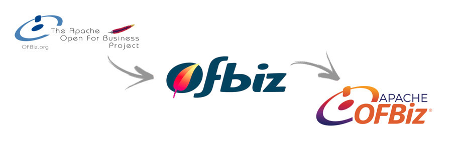
Good timing for a new Apache OFBiz logo
It was a real honor to work with the Apache OFBiz® team to develop the new Apache OFBiz logo. The timing couldn’t have been better. “Apache OFBiz” recently became a registered name rather than a trademarked name. Sharan Foga and I were also working on an update to the structure, layout, and look of the Apache OFBiz website (coming soon). And with the recent rebranding of the Apache Software Foundation (ASF), the timing was perfect for an updated logo.
There was a lot of healthy back-and-forth with members of the OFBiz community. Requirements for the update included:
- update the logo from “Ofbiz” to “OFBiz”
- add “Apache”
- incorporate the new look of the ASF
- change ™ to ®
First round

The first challenge was to convert the existing custom font’s lowercase versions of the letters “f “and “b” to capital letters. The results were not to my liking. I then shifted focus and replaced the previous version (red and yellow) of the Apache feather with the new version of the feather (gradient). I liked elements of this attempt, but felt that it didn’t work as a whole. Brain storming was in order again.
Second round

After a thorough review of various well-designed logos, I took a different approach. I found a new (but similar) font that didn’t require much customization. With this font, the capital letter versions of “F” and “B” looked great. To incorporate the look and feel of the new Apache logo, I applied a gradient to the letter “i” similar to that of the of the Apache feather. I changed up the font colors font, and with having the entire “i” including the dot with a gradient, and some without. Definitely better than the first attempt, but not quite “there” yet.
For both inspiration and context, I asked Sharan for additional examples of previous OFBiz logos. She shared them with me. As I reviewed them, one logo really caught my attention. One component of the logo– a graphic based on the universal power button symbol–seemed like a great fit for the updated logo. Because the OFBiz platform is so powerful, I felt this was very fitting. I also liked that this design would honor the “old” and embrace the “new”.
Final round

When I applied the Apache feather gradient to the power button element, the design really came together. It was then natural to add “Apache” above “OFBiz” in the same font as that of the Apache Software Foundation logo. I tried out multiple color options , including adding the teal of the old OFBiz logo into the Apache feather gradient, but that didn’t seem to work. Purple lettering for Apache and orange for OFBiz hit the spot!
The OFBiz Community
While this logo felt right to me, the final decision belonged to the OFBiz community. Based on their feedback during the logo creation process, several options were presented for voting. I was stoked to learn that my favorite version had received the majority of the votes!
Having the opportunity to work with the OFBiz community– first on the rebranding of the ASF and again with the OFBiz logo project– has been a great experience for me. It’s reminded me of how much things change in the software world. The community constantly updates and improves upon the OFBiz code. I’m happy be able to share my skills with a community that devotes much time to improve OFBiz.


